Imagine you’re in a fitting room, looking at the mirror, and you put a scarf over your shoulders. Sometimes it makes everything pop, other times it just washes you out. That’s where seasonal color analysis comes in-it helps figure out the colors that really work with your natural vibe, making your outfits feel easy and put-together. But there’s a lot of confusion out there. Is it really just some passing trend? Does everyone squeeze into one of the four seasons? And what about more than just your skin tone-think draping fabrics or how your colors might change over time? Let’s correct these myths using facts from color experts.
Myth 1: It’s Just a Fashion Fad
Seasonal color analysis isn’t some quick trend that’ll fade away. It goes way back to ancient Egyptians and Greeks who figured out how to pair colors with skin tones. The whole thing really took off with Johannes Itten’s 1961 book, ‘The Art of Color.’ That inspired folks like Carole Jackson back in the 80s to create those palette systems we know today, showing it’s more than just a fashion thing.
Nowadays, it’s backed by color experts. And get this-studies show that folks who used seasonal palettes end up way happier with their buys, like 65% more satisfied or something.
Also, choosing colors that fit your season, like the cozy warm Autumn shades, can improve your mood and increase your energy-studies show it can raise it by up to 20%.
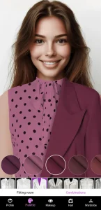
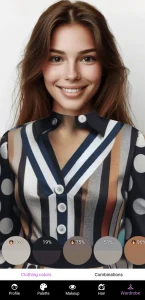
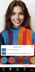
If you’re curious to give it a go, check out the Dressika app. Just upload your photo, play around with color harmonies, and watch how they make your natural tones shine.
Myth 2: Everyone Fits Perfectly into One Season
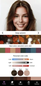
Truth is, only about 20% of folks fit perfectly into one of the four basic seasons. Most people end up in these detailed categories, like Soft Summer or Deep Autumn. This happens a lot with the 12-season or 16-season divisions.
So, to figure out your palette, mix in tests for hue (that’s cool or warm), value (light or dark), and chroma (bright or muted).
High contrast works well for Bright Winter, for example, because of those clear cool colors. Low contrast? That’s more Muted Autumn’s soft, earthy feel. And if you’ve got neutral undertones, you might mix Cool Winter’s crisp iciness with Warm Spring’s soft warmth.
For spot-on results, try the 12-season quiz in the Dressika app. It weighs undertone at 60%, contrast at 30%, and clarity at 10%, helping you nail those colors that just work for you.
Myth 3: Skin Tone Alone Determines Your Season

Skin undertone is a big starting point, sure, but you can’t stop there. A full analysis looks at hair color, eye color, and the overall contrast too-like how fair skin with golden undertones and red hair usually screams Spring, not just from the skin part.
To bust this myth about skin being everything, go for a broader approach. Start with the vein test: blue veins mean cool undertones (that covers about 40% of people, based on US Color Association guidelines), while green veins mean warm undertones. Don’t forget eyes and hair: olive skin paired with brown eyes might mean Deep Autumn, and fair skin with blue eyes could be Cool Winter.
To get hands-on, try a simple DIY: grab some fabric swatches from different seasons-like Spring’s bright corals-and hold them up to your face in good light. See if they make you look brighter or kind of dull. The Dressika app has a free 12-season chart to track it all, and you can unlock your beauty by mastering color analysis in just 1 minute.
Myth 4: Warm vs. Cool Is the Only Factor
It’s not all about warm versus cool, you know. Your season depends on three key things: value (light or deep), chroma (bright or muted), and contrast. So, someone cool but muted might be Soft Summer, instead of straight-up Cool Winter.
The Munsell Color System actually quantifies all that stuff.
Chroma is the saturation level of a color. High saturation creates strong jewel tones. Low saturation creates soft pastels.
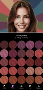
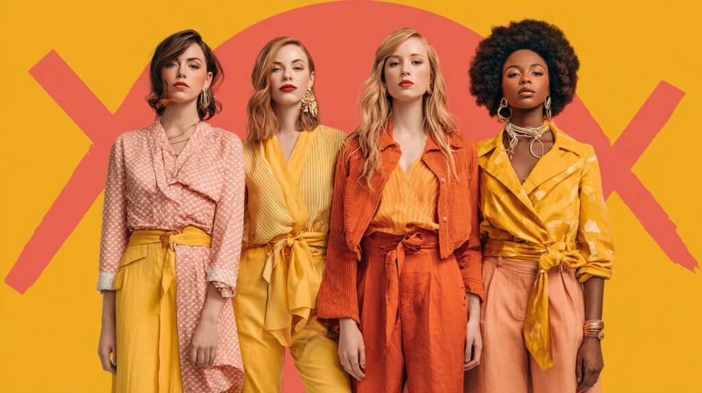
Clear Spring is a warm, bright set with lots of contrast, filled with sunny daffodils and corals. Or cool, muted colors with low contrast for Soft Summer, think dusty lavenders and soft grays.
Myth 5: Professional Draping Isn’t Necessary
Draping under natural light really shows those subtle reactions you can’t catch in photos. Professional sessions, which run about $300-500, hit around 85% accuracy, way better than the 60% from DIY quizzes, say the color pros.
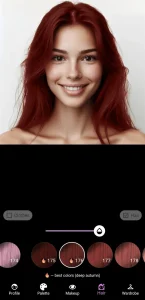
The Dressika app offers AI-powered color analysis with virtual simulations via photo uploads, helping capture those subtle shifts in natural lighting for better accuracy-pros say it gets close to what you’d see in person.
Start with the free tools in the Dressika app to get basic color information, then consider a professional session for custom palette swatches and ongoing access to color guides through their website.
Myth 6: Your Season Never Changes with Age
As skin loses melanin and hair turns gray-from red to silver-your color season can shift too. For example, a Bright Spring in your younger days might ease into Soft Autumn, and about 40% of adults notice these changes after 40, per dermatology reports.
Aging typically reduces skin contrast from high to low, as melanin depletes and tones soften, according to a 2019 Aging Cell journal study on pigmentation loss.
For instance, fading red hair often aligns with Muted Autumn palettes, while graying black hair suits Cool Winter’s cooler undertones. Color experts indicate 35% of individuals require re-analysis every decade.
To adjust, test again each year with the vein test-check wrist veins for blue (cool) or green (warm) colors-or by draping gray hair with color swatches from different seasons.
The Dressika app offers color analysis that account for age-related changes.